MLP Mesa by Margaritaville is upon us. Starting January 26th, the most anticipated event in pickleball history begins and we will have 4 straight days of the beautiful game.
Since the Major League Pickleball Draft took place in mid-December, the 24 teams have been broken down over and over with many experts giving their picks as to who will walk away with the Gold in each league.
Read Next: MLP Draft Results
We have ranked the teams’ power, speed, and even intangibles, but the last, but maybe most important, aspect of each team to rank is the logos. Starting with the Premier League…….
TIER 1: The Mona Lisa Division
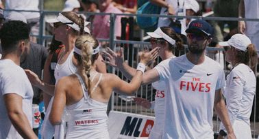
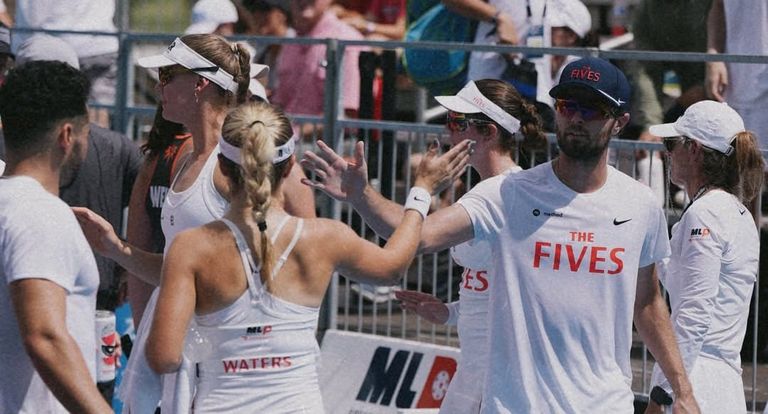
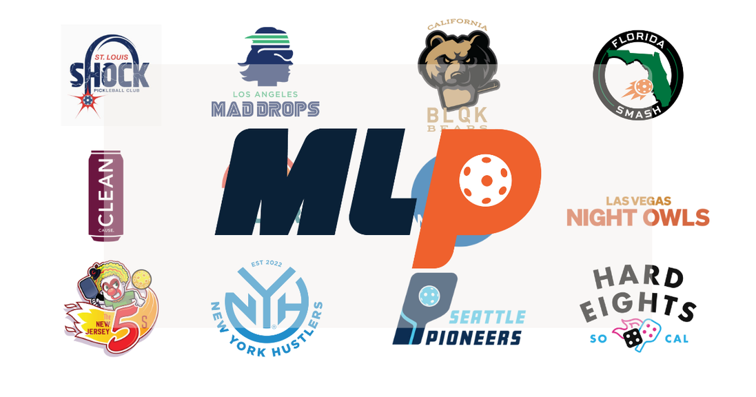
- New Jersey 5’s
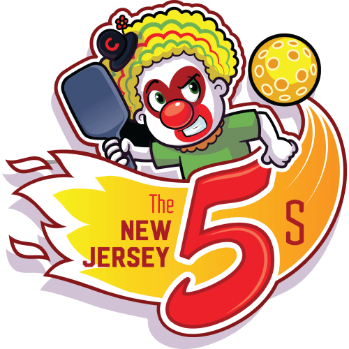
The easiest decision in this whole power rankings was the team at the top. There is no denying that the team from the swamps (yes I am a snobby New Yorker who thinks Jersey smells) carries the best logo in all of Major League Pickleball.
Featuring a character from Series 2 of Gary Vee’s Vee Friends called “Competitive Clown” this logo gives off some “do not mess with me vibes”. In some alternative universe, maybe under the influence of the perfect mushroom cocktail, you may see this clown starring as It in the animated remake of the Stephen King classic.
Look for this Competitive Clown to be all over pickleball merch you see at different events across the country as The 5’s have the perfect combination of skill on the court and branding swag off of it.
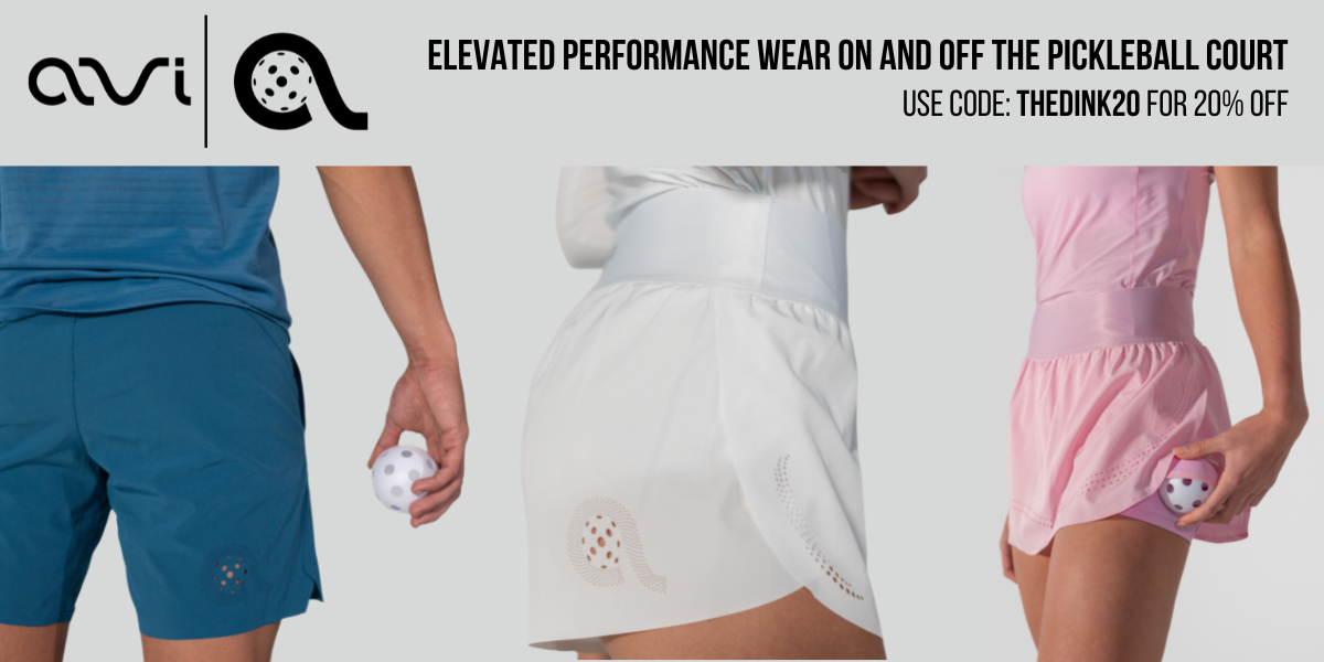
Performance wear from Avi Athletics will instantly become your go-to pickleball gear. Save 20% with code THEDINK20.
TIER 2: The Picasso Division
2. Los Angeles Mad Drops
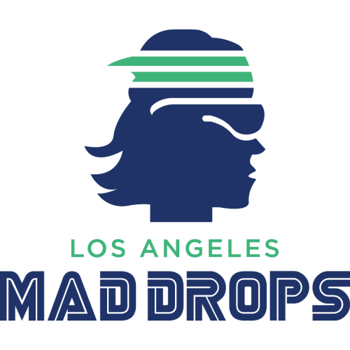
Vibes. Vibes. Vibes. Vibes. And I am not talking about the PPA professional league formerly known as such. Something about this logo just sticks with me.
With one singular and shadowy silhouette, the team from Lakerstown has found a way to capture the hearts and souls of all of us diehard pickleball fanatics. Head band, glasses, we are the try-hards of all try-hards just looking to perfect our craft.
Fans from Los Angeles, and across the world, will be able to look at the Mad Drops logo and see themselves staring back at them. I wonder if this team will ever let fans name their logo? The pickle dude? Could be something to look out for.
3. BLQK Bears
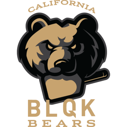
Bear Down! Roar! *Other teams named bear cliches you have heard so often* This logo is fierce and this logo give professional sports team feel. Based on my years of experience in the wild, it looks as if the artist based on a 6 year old female Californian Grizzly. And an angry one to boot.
Due to how popular animal names are when it comes to sports teams it can be seen as a risk to follow in suit, but BLQK found a way to pass the test and put another spin on it with their pickleball paddle chewing mama grizzly. In the near future could it be possible to see this big bear on some coffee products?
Tier 3: International Art Show Winners Division
4. Hard Eights
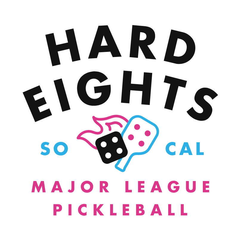
Welcome to Vegas baby! Oops I mean Southern California (sorry Mr. Parks LOL). Regardless of where this team calls home, the logo hits hard.
Hard Eights is a fantastic name and the logo makes itself. A paddle with flames and dice? Seeing this combination really brings out the degenerate fan in me. Maybe this team turns So Cal into the new casino capital of the world?
My guess is this logo makes people want to gamble their fandom on the Hard Eights, and ride with them into the first event in Mesa. One note would be to potentially make the name a tad smaller and the paddle and dice a tad bigger.
5. Hustlers
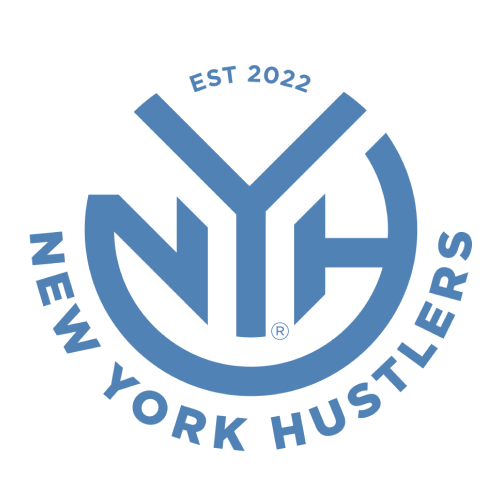
NEW YORK, STAND UP. The logo of the team that hails from the handsomest, the smartest, and the sexiest state in all our beautiful country, New York. All bias put aside, I legitimately think this is the cleanest logo of the bunch.
Not much color, not much glitz or glam, but it really gets the job done logo wise. For those familiar with soccer logos, this one will be easy on the eyes. This one does an A+ job of giving off a professional franchise feel.
I am also a sucker for “Est (year)” so that is a nice touch at the top of the logo. Sports is history and history is sports. Will be very interesting to see which way they go when it comes to a mascot, this logo leaves the door open for anything.
New Arrivals from LOTTO. Up your shoe game and protect your feet with the selection at fromuthpickleball.com. Use code 10DINK for 10% off (some exclusions apply).
6. Las Vegas Night Owls
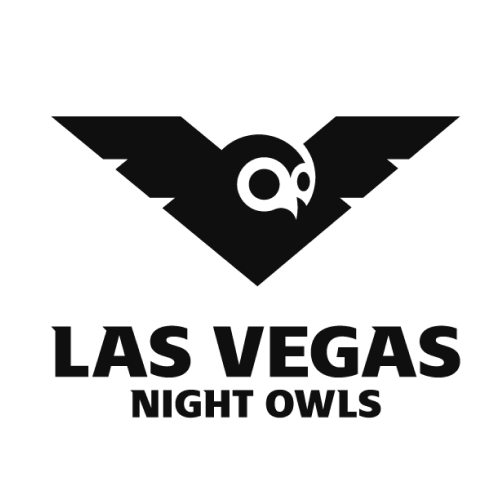
The last, last logo entered surely lived up to the hype. Knowing how seriously the ownership group from Las Vegas was taking this, we all knew whatever they eventually released was going to be straight fire. And hoot, hoot, hoot, hoot, here we go.
Spreading its wings over the pickleball world, this logo is super slick looking and the all black everything color is tough. More like a battle owl than a night owl. That is another thought I had, aren’t all owls night owls? Also, deducted a few points for tardiness.
7. St Louis Shock
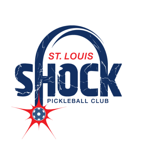
The last logo entered into the premier league certainly did not cut any corners to get there. Very happy that the wonderful pickleball city of St Louis is officially getting their own team, and the logo does them justice.
The size and block lettering of the name provides shock value (see what I did there?) and the lightning running through the letters of the name is electric (see what I did there?). One note, part of me think the team name should be “St Louis Bombers”.
First, shock reminds me of Wichita State Shocker who are not far away and second, it looks like a pickleball bomb at the bottom of the “H”. Cool logo though.
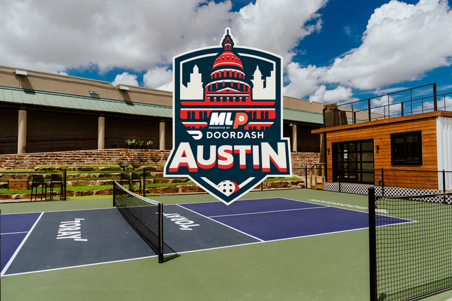
8. ATX Pickleballer
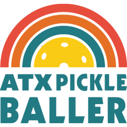
Happiness, rainbows, butterflies, dancing, frollicking, singing, gallivanting, all words that come to mind when I see the ATX logo. Seems simple at first, but what a deep logo and one certainly fitting of the team that calls the unofficial pickleball capital of the world its home.
A pickleball surrounded by colors of the rainbow, illustrating that this game is for everyone and everyone. Or maybe I am thinking too deeply. Maybe it’s just half a pickleball and different color lines. Whatever, let me believe. Go ATX Go.
9. Pioneers
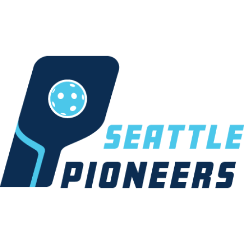
“TaKe Me To YoUr LeAdEr” This logo gives off some serious futuristic, robotic vibes. And based on some (or one) player on this team, some people have labeled this team the “evil empire” so maybe this look fits.
Similar in style to the New York Hustlers in terms of being clean, but much more evil looking, the official logo of Pickleball.com makes its way to a Major League Pickleball team.
With the look and feel of a “pro-establishment” and “pickleball corporation” this may be an easy team to root against, but from a pure aesthetics perspective this logo looks good.
Tier 4: Good Job Division
10. Clean Cause
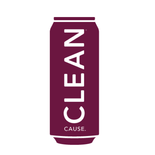
From a pure looks standpoint I put this logo at #9 but if the mission behind the logo was all we were basing these rankings off of, this team would be first.
Not going to give much analysis but instead let you know what Clean Cause is all about as it is a company that hits home for me: “Our mission is to support individuals in recovery from alcohol and drug addiction by donating 50% of our net profits* or 5% of net revenue*, whichever is greater, to the CLEAN Cause Foundation.”
Tier 5: Foot Fault Division
11. Mashers
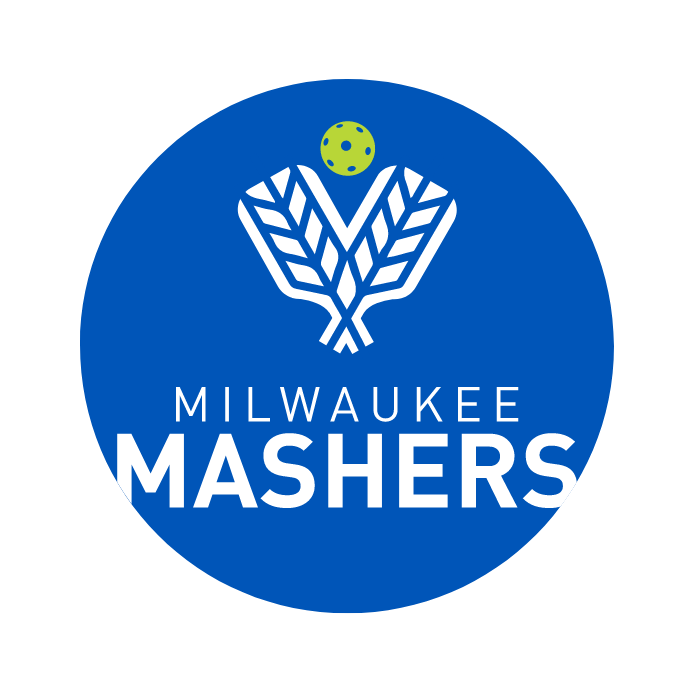
Funny story about this logo. I would have it much higher if Team Owner James Blake lied to me when I asked him, “Is your logo an homage to Giannis?” He said no, but come on, it was a good question right? You can’t tell me that there isn’t some greek, and even a little olympic, flair to the logo and color scheme.
Those paddles are made in Greece, you will never convince me otherwise James! They may be from Milwaukee but as long as this is their logo they will always be THE BIG FAT GREEK MASHERS.
12. Florida Smash
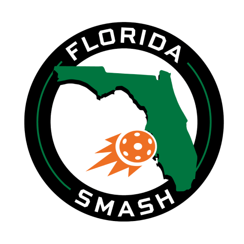
Well what do we have here? It is a state. And it is a recognizable state. I guess that is cool. It is green. Money is green and you get money for winning MLP events. I guess that is cool too.
Very simple, very geographical, the way I would describe this logo is “Facts Only”. Do not even know if that makes sense. But again, it's just a picture of a state. Also, not sure if the pickleball ramming into the west coast of Florida is good foreshadowing for a team that will play a ton of their events during hurricane season.
It will be interesting to see if New York Hustler and New Jersey 5 fans become Florida Smash fans during the winter months.
Written by: Zook
Twitter: @PonyZook
If you want to keep up with everything pickleball, you’ve got to sign up for our newsletter. We break news faster than anyone in the game. Subscribe below:
Zook
Love Pickleball? Join 100k+ readers for free weekly tips, news & gear deals.
Subscribe to The DinkGet 15% off pickleball gear at Midwest Racquet Sports